About
NTUC U Care is a pivotal initiative by the National Trades Union Congress in Singapore, dedicated to supporting low-income union members and their families. Its core mission involves providing financial and educational assistance through programs like the NTUC Care Fund and e-Vouchers. Recognizing the need for a user-friendly and efficient online platform, this project aimed to streamline aid distribution, program management, and enhance overall member empowerment.
Styles
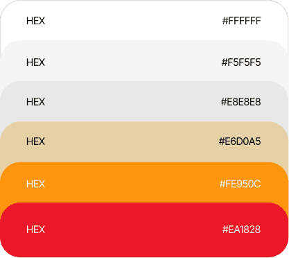
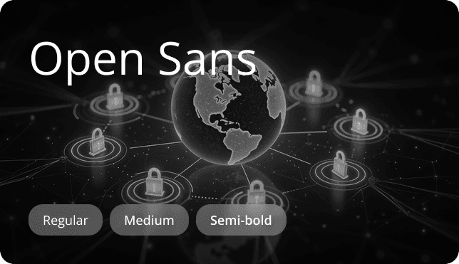
A cohesive style system that strengthens brand trust through consistent colour, typography, and imagery. The result: an elegant, approachable interface that communicates reliability and elevates user perception.
Challenges
NTUC U Care faced critical operational and digital limitations: 1. Outdated Digital Presence: Legacy interfaces lacked clarity, accessibility, and mobile responsiveness. 2. Inefficient Program Management: Manual workflows slowed application processing and aid disbursement. 3. Lack of Centralized Data: Fragmented data limited reporting, visibility, and strategic decision-making. 4. Poor Applicant Experience: Complex navigation increased friction and application drop-offs.
Outdated & Inaccessible Digital Presence
Existing interfaces lacked modern design, intuitive structure, and mobile responsiveness, hindering user navigation and accessibility.
Inefficient Program Management
Manual and fragmented processes for managing assistance programs, tracking applications, and disbursing aid led to significant operational bottlenecks.
Suboptimal Applicant Experience
Members encountered complex navigation and difficulty finding information, causing frustration and potential abandonment of aid applications.
Lack of Centralized Data
Disparate data sources impeded comprehensive reporting, strategic oversight, and informed decision-making for fund management.
Solutions
Wugweb partnered with Icube to deliver a unified digital ecosystem across UX, development, and systems integration: 1. Modern Responsive Platform: Built a contemporary, mobile-first interface across public and applicant journeys. 2. Simplified User Journeys: Redesigned information architecture for easier discovery and eligibility understanding. 3. Streamlined Applicant Portal: Introduced guided, multi-step applications with clear progress tracking. 4. Centralized Admin Backend: Developed dashboards to manage programs, applications, and disbursements efficiently. 5. Unified Data Management: Established a single source of truth for programs and beneficiaries. 6. Improved Communication Tools: Enabled timely updates, resources, and engagement with members.
Modern & Responsive Platform Interface
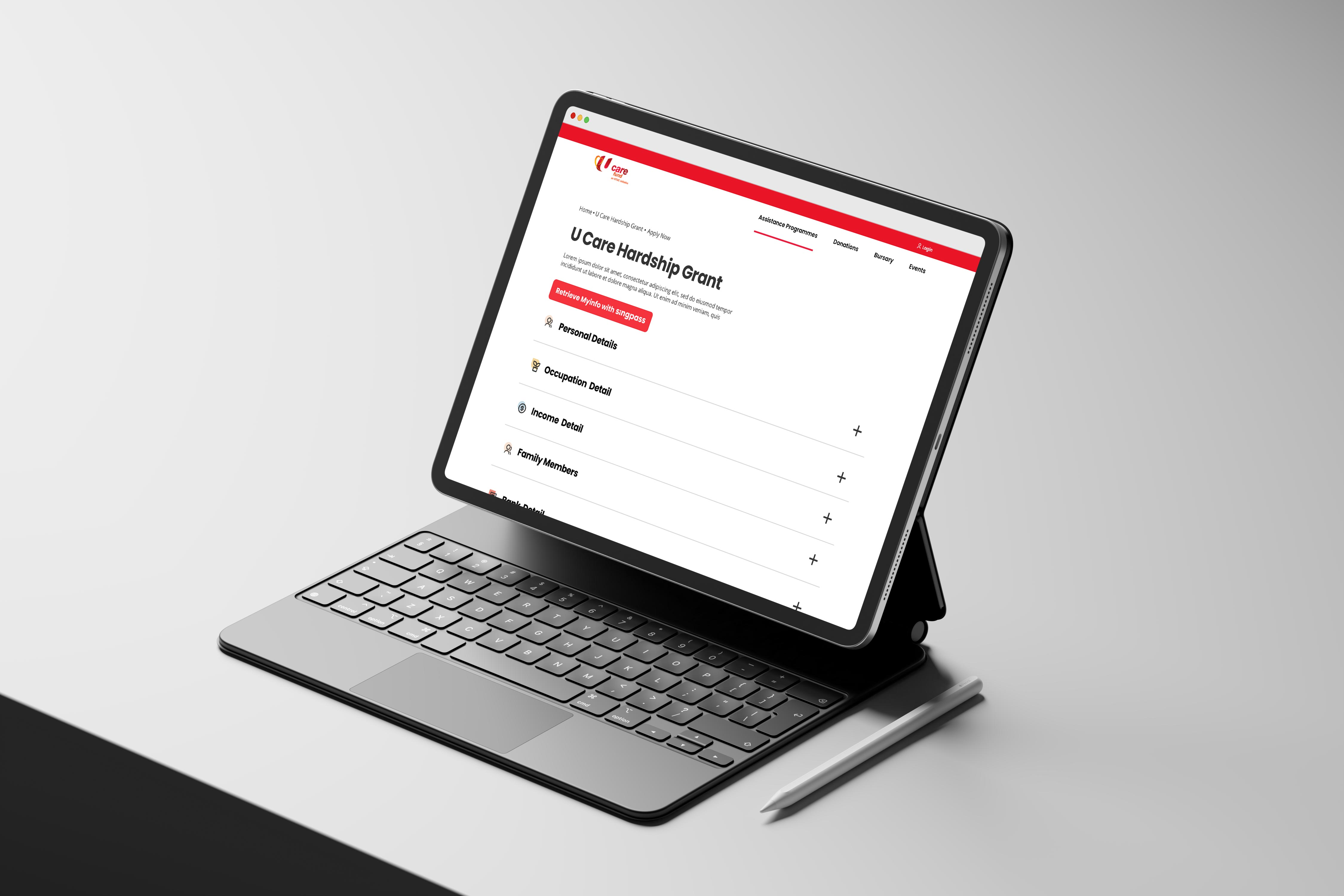
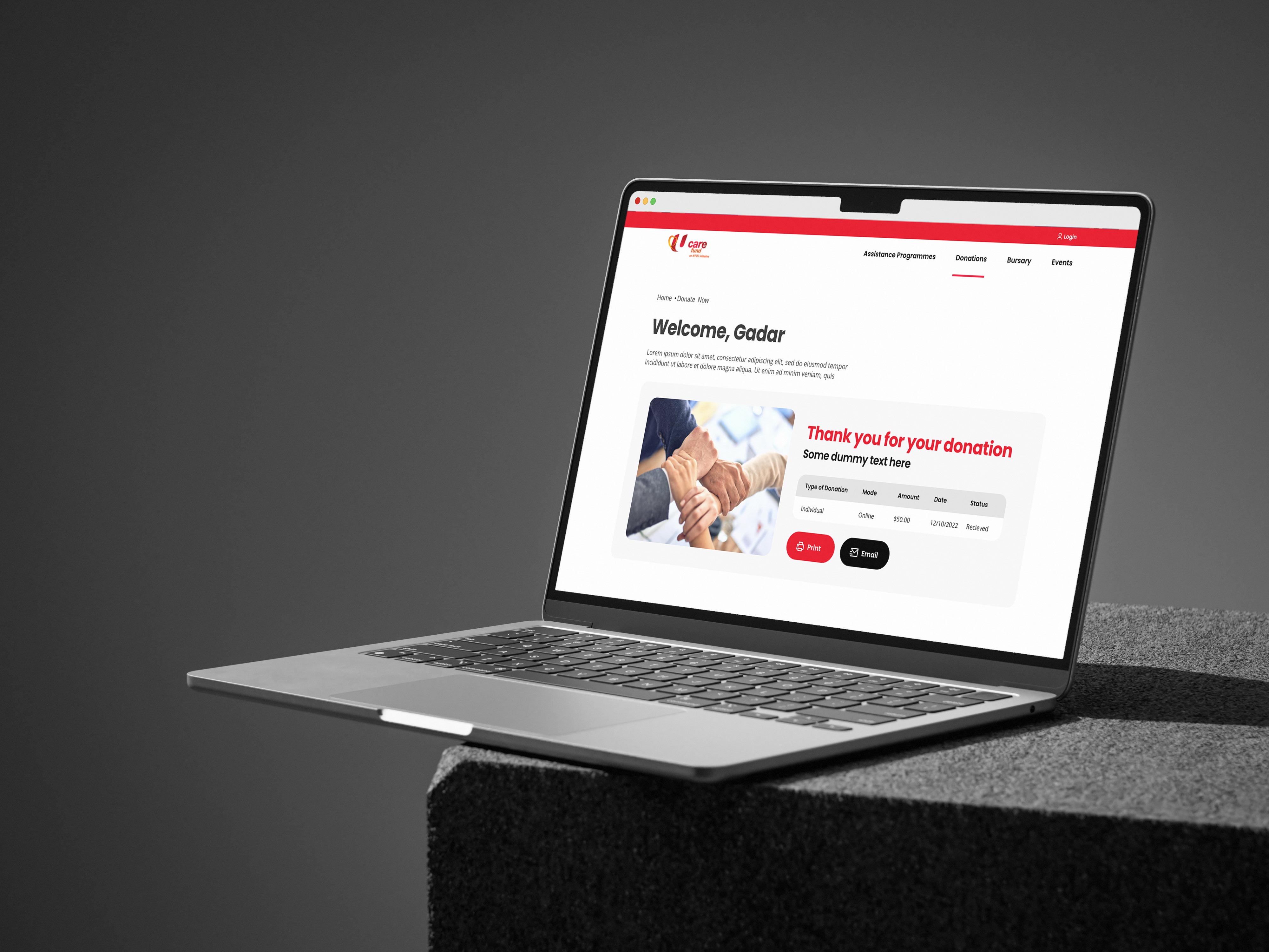
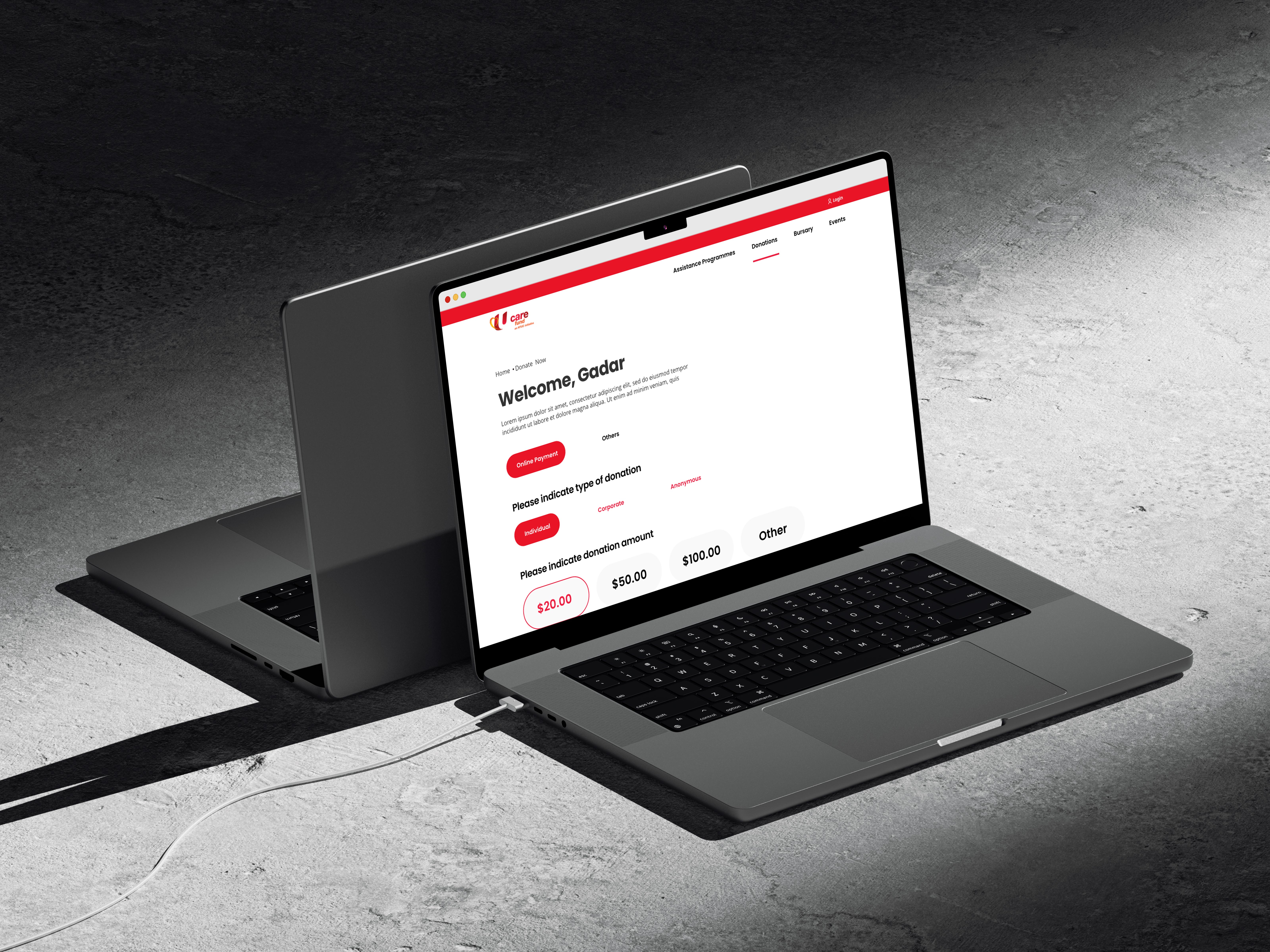
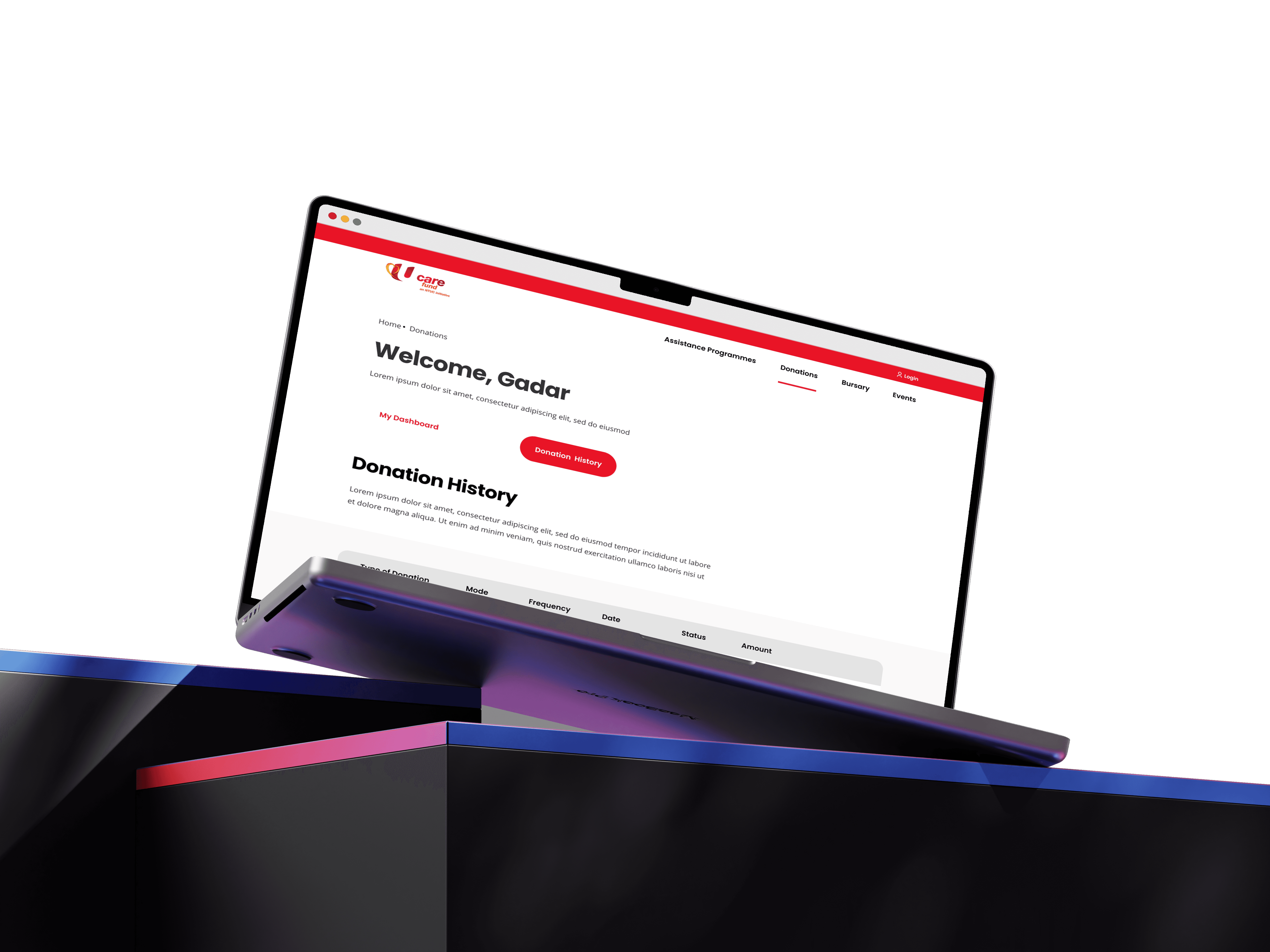
A contemporary, visually appealing, and fully mobile-responsive interface was developed for all public and applicant areas, ensuring optimal usability across devices.
Intuitive User Journeys
Information architecture and navigation were meticulously redesigned to simplify the process for members to discover programs, understand eligibility, and complete applications efficiently.
Comprehensive Applicant Portal
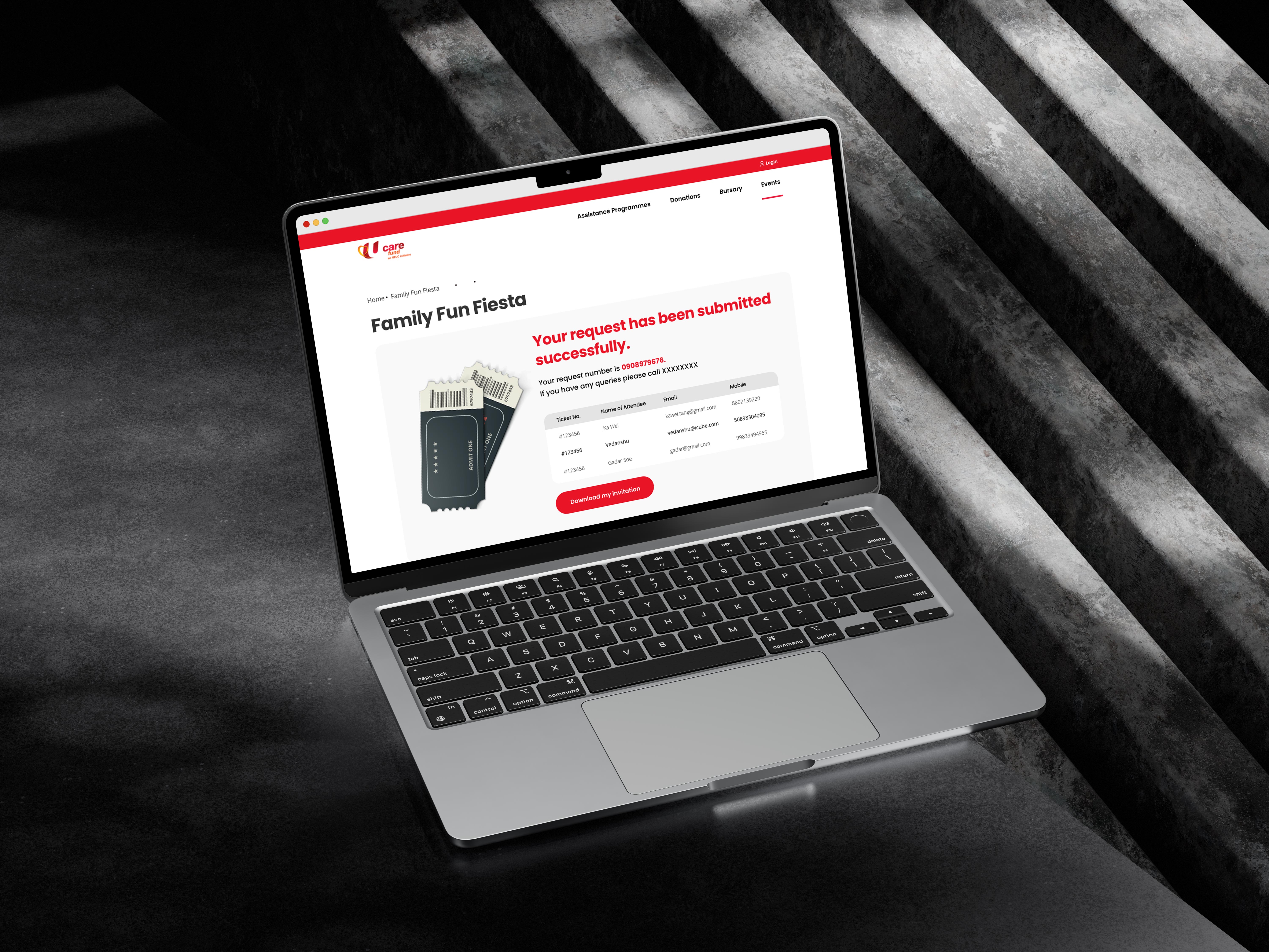
A streamlined and accessible portal was built, guiding users through multi-step application processes with clear instructions and transparent progress tracking.
Robust Administrative Backend
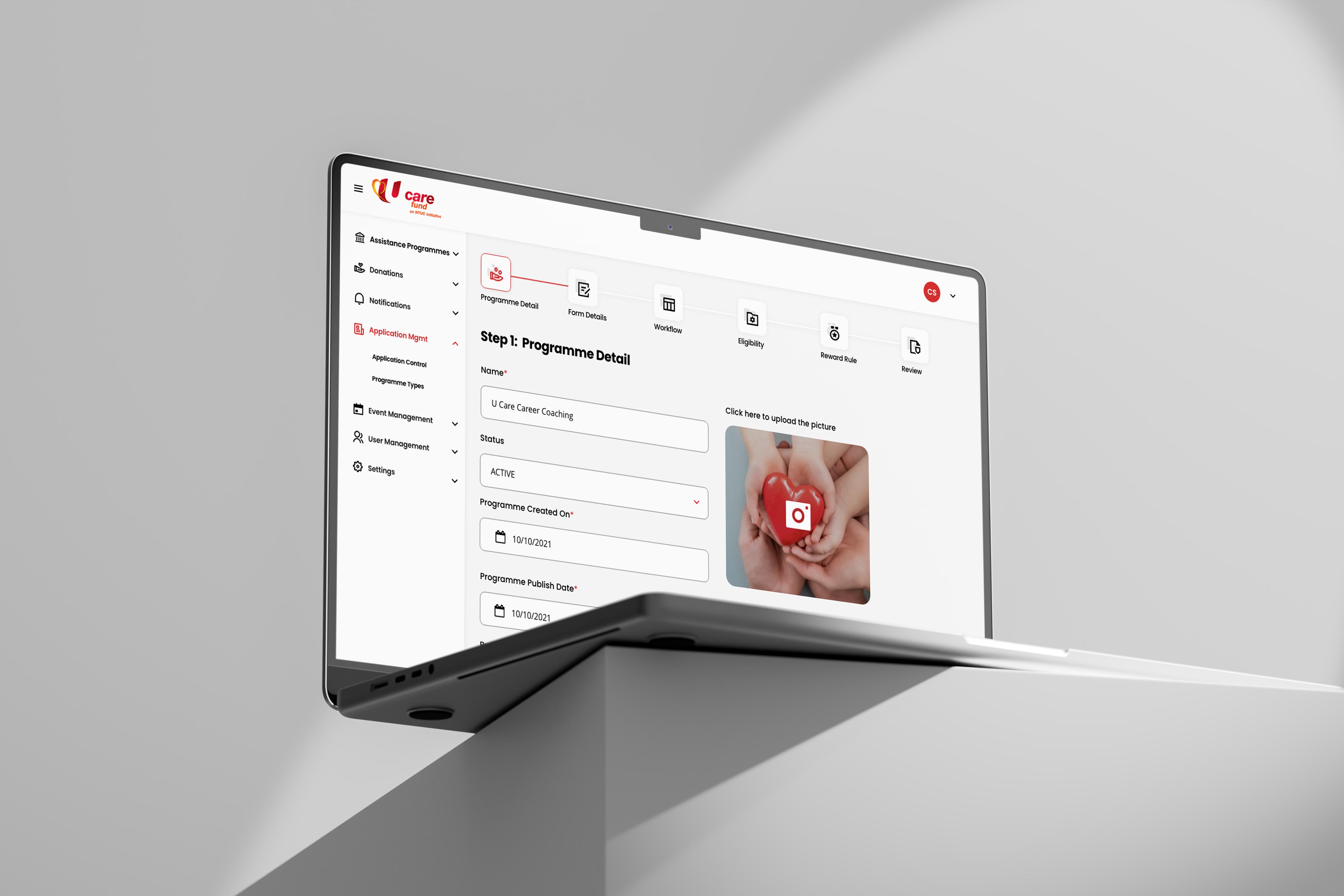
A powerful internal management portal was developed to centralize and automate critical operations, including program creation, application processing, and disbursement oversight via sophisticated dashboards.
Centralized Data Management
A single source of truth was established for all program and beneficiary data, enabling efficient management, comprehensive reporting, and valuable analytics for strategic resource allocation.
Enhanced Communication & Support
The integrated platform facilitates improved communication with members and beneficiaries, enabling efficient dissemination of updates, resources, and fostering greater engagement.
Impact
The transformation delivered measurable improvements across experience, operations, and service delivery: 1. Improved Accessibility & UX: Members accessed support programs more easily across devices. 2. Operational Efficiency Gains: Centralized systems reduced manual effort and processing delays. 3. Better Beneficiary Outcomes: Simplified applications increased successful access to aid. 4. Stronger Institutional Credibility: A modern platform reinforced trust and organizational authority. *
Enhanced User Experience & Accessibility
The intuitive platform significantly improved member experience, increasing engagement and access to crucial assistance programs for all users.
Streamlined Operations & Data-Driven Management
The robust backend and centralized data system drastically reduced manual effort and provided actionable insights, enabling more informed decision-making.
Improved Beneficiary Outcomes
Simplified application processes and enhanced communication empowered members, making it easier to access needed support and improving overall well-being.
Strengthened Brand & Credibility
A modern, well-designed, and efficient digital presence reinforced NTUC U Care's reputation as a leading provider of social support services.
Strategic Insights & Design Philosophy
The project emphasized clarity, efficiency, and inclusive digital access: 1. User-Centric Ecosystem Design: Tailored journeys for members, applicants, and administrators. 2. Operational Efficiency Through Systems: Digitization replaced fragmented manual workflows. 3. Accessibility as a Core Principle: Design prioritized usability, responsiveness, and inclusivity.


Operationalizing Efficiency
Digitizing and centralizing fragmented manual processes was a core insight, directly leading to significant operational efficiencies, cost savings, and improved program oversight.