About
Airtel Xstream Play consolidates India's fragmented digital entertainment landscape, bringing a multitude of streaming partners under one seamless roof. Wugweb's pivotal role was to design a compelling Airtel Website page for the "Xstream Entertainment Festival." This page was crucial for effectively communicating the platform's vast offerings, unique value propositions, and diverse access models to a broad audience, driving engagement and subscriptions within Airtel's extensive digital ecosystem. ## Challenges Promoting a large OTT ecosystem required clarity and persuasion: 1. Complex Value Proposition: Aggregated content benefits were hard to explain. 2. Conversion Pressure: Users needed a clear path to subscription. 3. Unique Access Models: Bundled and location-based unlocks needed clarity. 4. Mass-Market Appeal: Diversity of content had to feel unified and accessible. --- ## Solutions Wugweb and Dentsu Webchutney designed a high-impact festival landing page: 1. Clear Value Messaging: Highlighted benefits and partner platforms upfront. 2. Transparent Subscription Offers: Explained prepaid-linked access clearly. 3. Localized Content Unlocks: Communicated region-based entertainment benefits. 4. Simplified Access Steps: Reduced friction in claiming subscriptions. 5. Vibrant Content Layouts: Used dynamic visuals to showcase variety. 6. Design System Alignment: Maintained consistency with Airtel’s ecosystem. --- ## Impact The page functioned as a strong acquisition touchpoint: 1. Improved Offer Clarity: Users understood access models quickly. 2. Higher Conversion Potential: Clear CTAs supported subscription growth. 3. Effective Value Communication: Content breadth resonated nationally. 4. Strong Campaign Asset: Festival page drove engagement and adoption. --- ## Strategic Insights & Design Philosophy 1. Offer Simplification: UX clarity drove decision-making. 2. Energy-Driven UI: Visual vibrancy matched entertainment context. 3. Digital Activation Focus: The page acted as a growth lever.
Styles
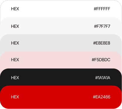
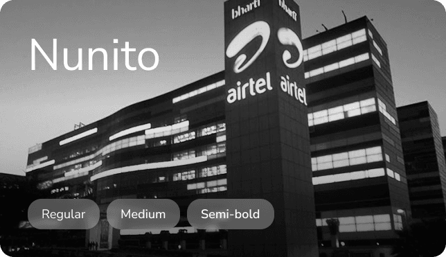
A cohesive style system that strengthens brand trust through consistent colour, typography, and imagery. The result: an elegant, approachable interface that communicates reliability and elevates user perception.
Challenges
** Promoting a large OTT ecosystem required clarity and persuasion: 1. Complex Value Proposition: Aggregated content benefits were hard to explain. 2. Conversion Pressure: Users needed a clear path to subscription. 3. Unique Access Models: Bundled and location-based unlocks needed clarity. 4. Mass-Market Appeal: Diversity of content had to feel unified and accessible. --- ## **
Complex Value Proposition: Aggregated content benefits were hard to explain.
Conversion Pressure: Users needed a clear path to subscription.
Mass-Market Appeal: Diversity of content had to feel unified and accessible. --- ## **
Unique Access Models: Bundled and location-based unlocks needed clarity.
Solutions
** Wugweb and Dentsu Webchutney designed a high-
Clear Value Proposition
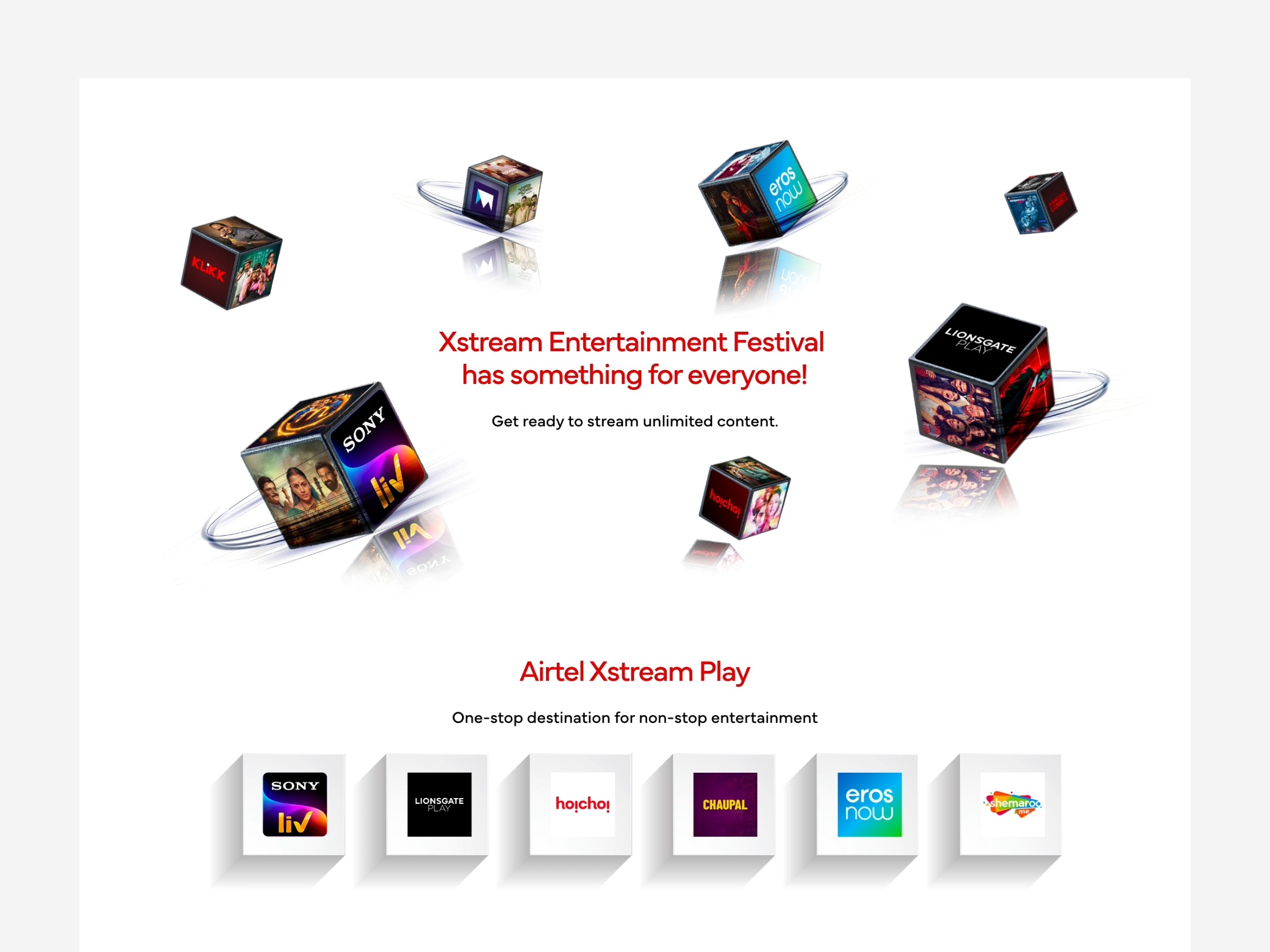
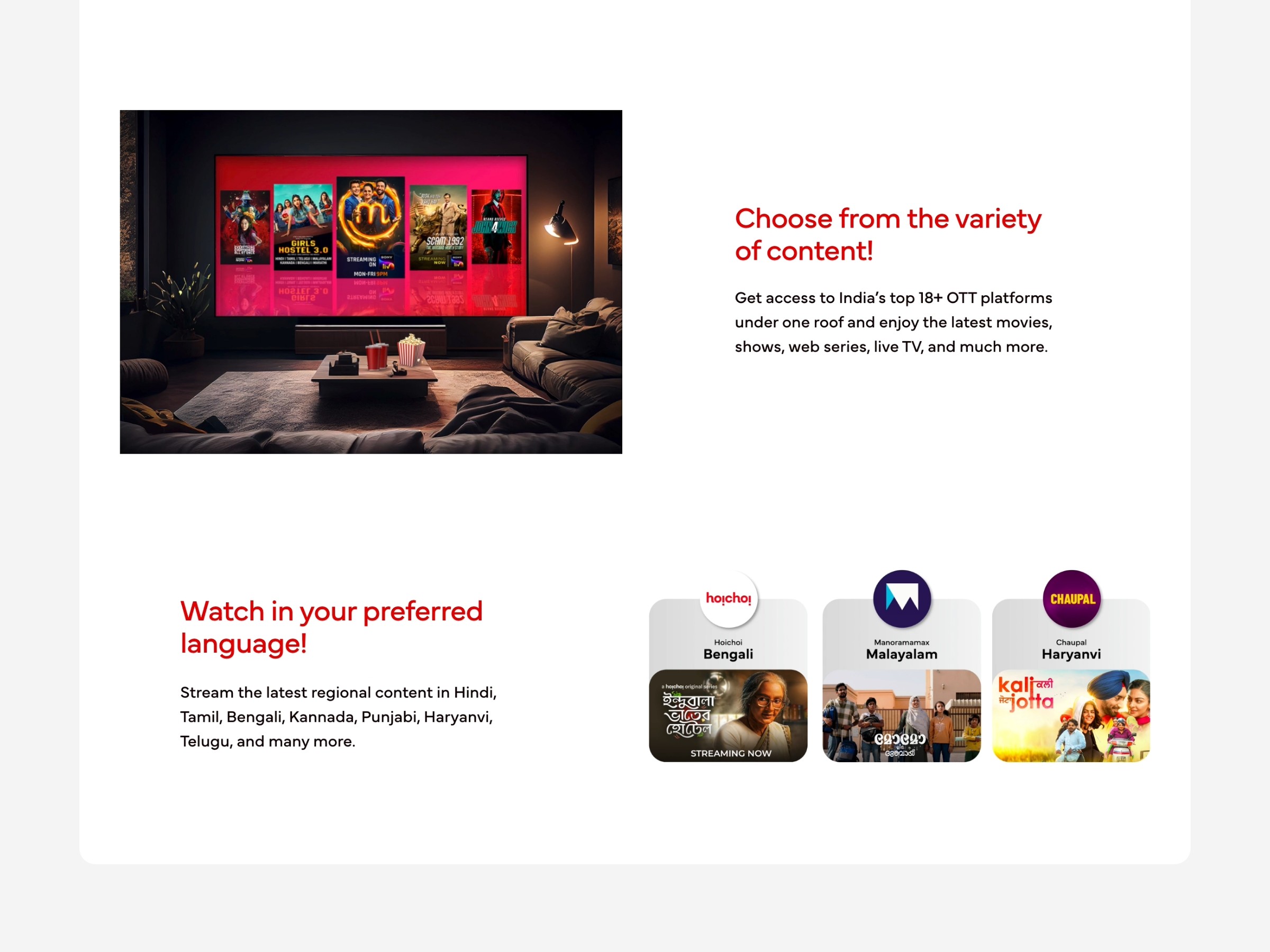
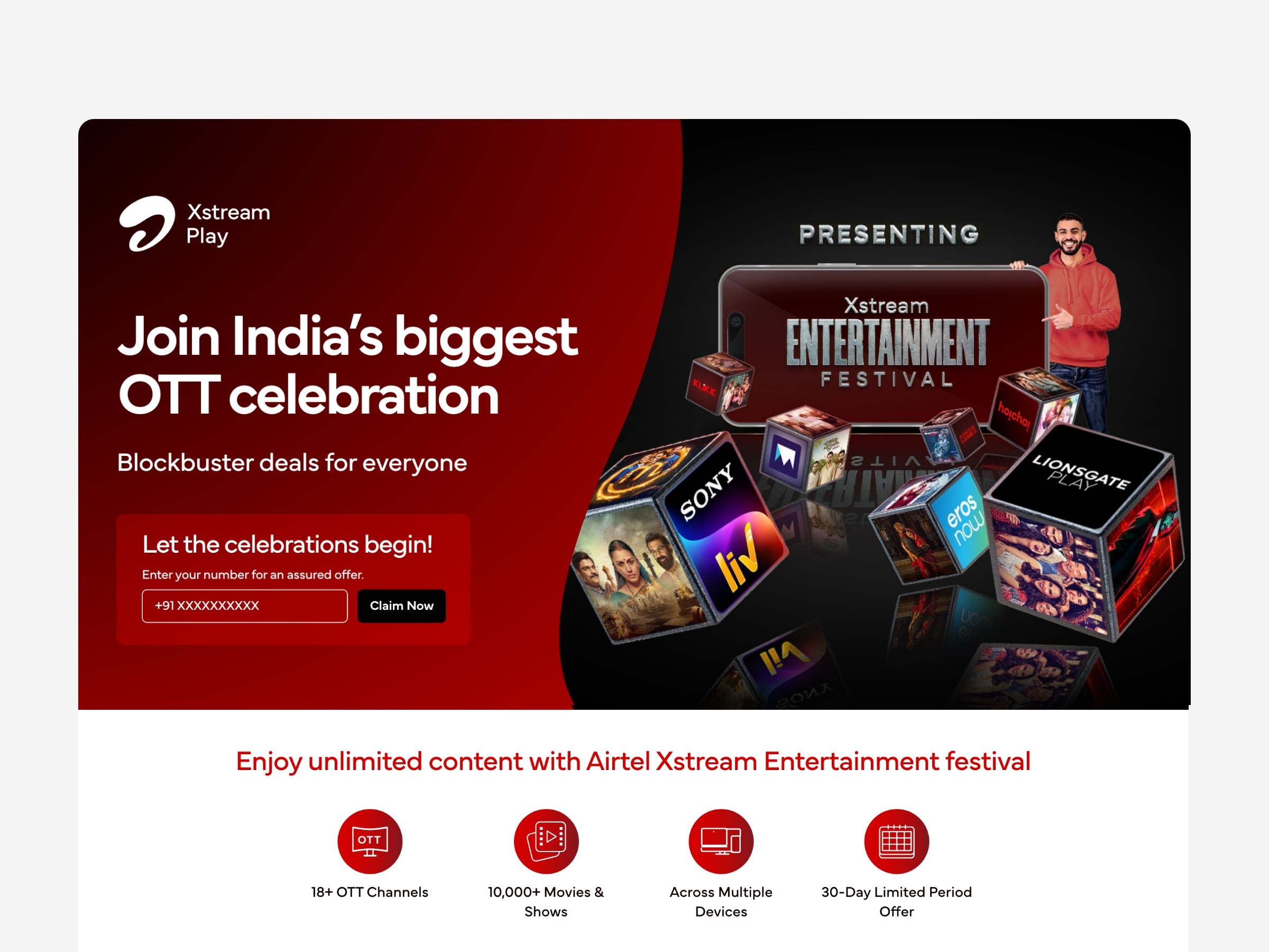
Highlights “Xstream Entertainment Festival has something for everyone” with dynamic layouts and partner logos.
Transparent Subscription Offers
Easy-to-understand sections explain free subscriptions through specific prepaid plans, encouraging conversions.
Localized Content Unlocking
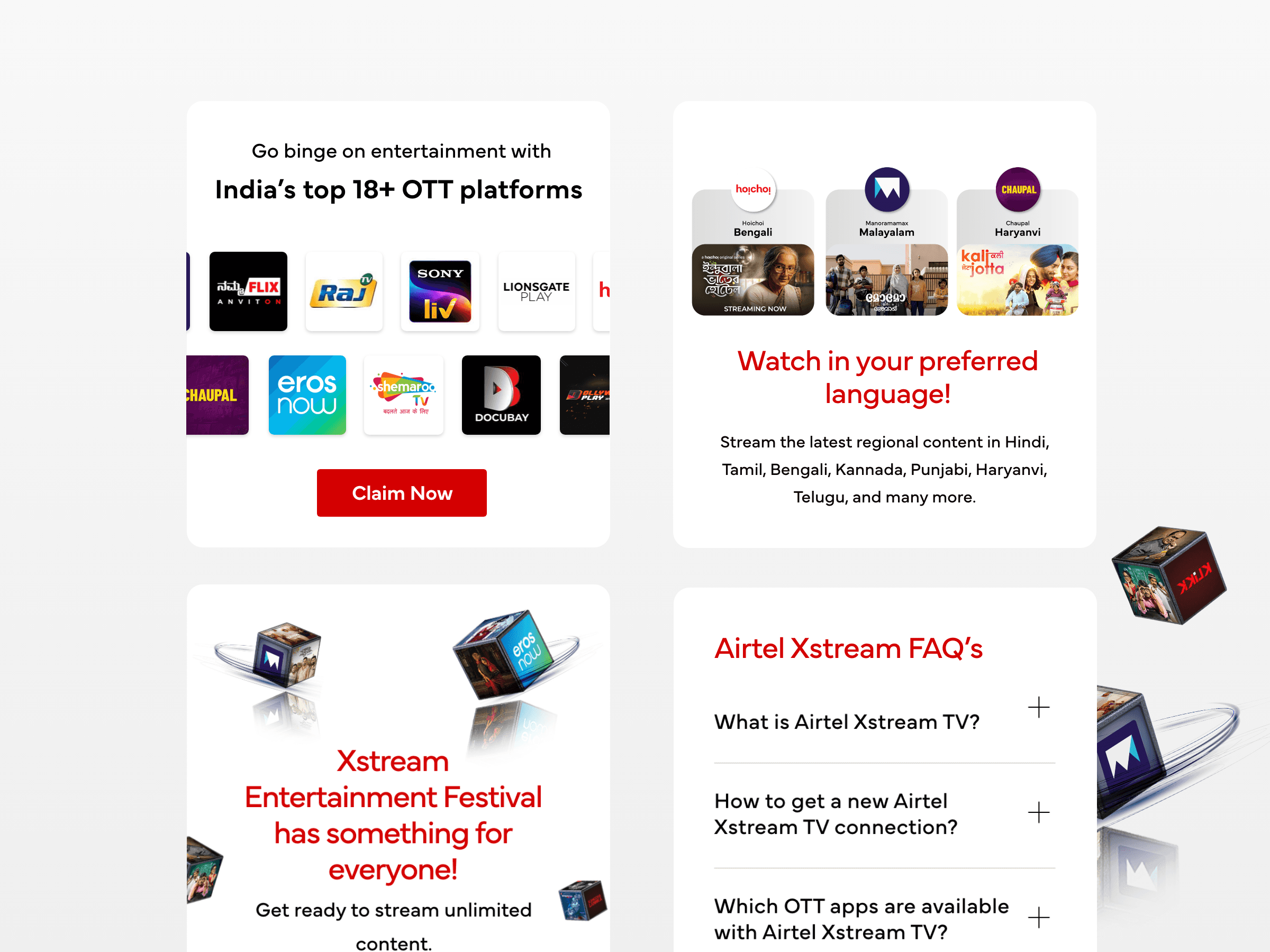
Communicates region-based content access, making the experience more personal and relevant.
Guided Subscription Access
Step-by-step CTA helps users quickly claim their free Xstream Premium subscription with minimal friction.
Visually Rich Experience
Vibrant visuals and dynamic content blocks showcase platform diversity and keep users engaged.
Consistent Design Integration
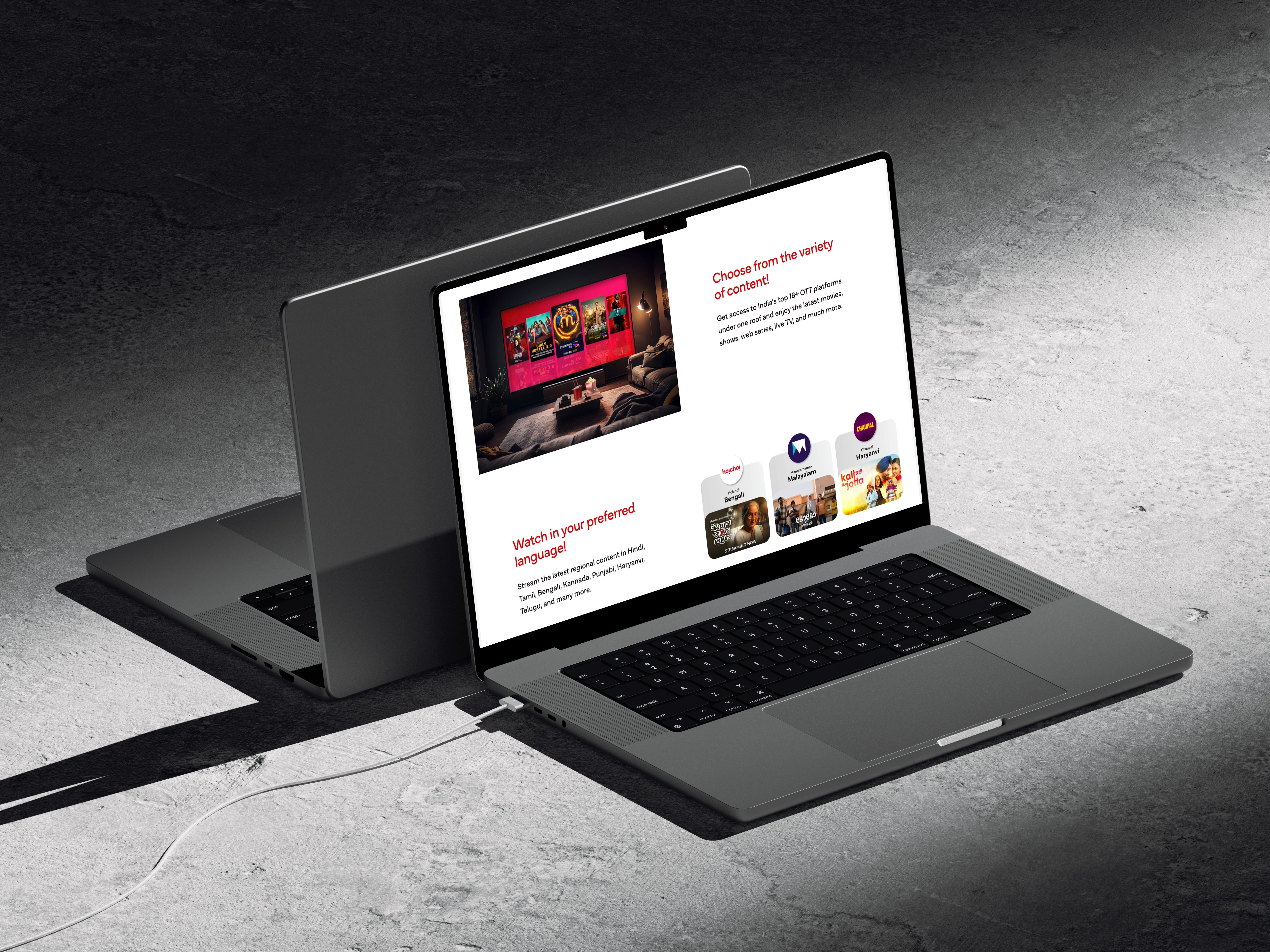
Seamless use of Airtel’s design system ensures brand consistency and user trust across the site.
Impact
festival landing page: 1. Clear Value Messaging: Highlighted benefits and partner platforms upfront. 2. Transparent Subscription Offers: Explained prepaid-linked access clearly. 3. Localized Content Unlocks: Communicated region-based entertainment benefits. 4. Simplified Access Steps: Reduced friction in claiming subscriptions. 5. Vibrant Content Layouts: Used dynamic visuals to showcase variety. 6. Design System Alignment: Maintained consistency with Airtel’s ecosystem. --- ## Impact The page functioned as a strong acquisition touchpoint: 1. Improved Offer Clarity: Users understood access models quickly. 2. Higher Conversion Potential: Clear CTAs supported subscription growth. 3. Effective Value Communication: Content breadth resonated nationally. 4. Strong Campaign Asset: Festival page drove engagement and adoption. --- ## **
Clear Value Messaging: Highlighted benefits and partner platforms upfront.
Transparent Subscription Offers: Explained prepaid-linked access clearly.
Localized Content Unlocks: Communicated region-based entertainment benefits.
Simplified Access Steps: Reduced friction in claiming subscriptions.
Strategic Insights & Design Philosophy
Offer Simplification: UX clarity drove decision-making. 2. Energy-Driven UI: Visual vibrancy matched entertainment context. 3. Digital Activation Focus: The page acted as a growth lever. ## **

Energy-Driven UI: Visual vibrancy matched entertainment context.